Transform Your Home Now With Expert Interior Design Secrets
Interior design can alter your perception of a room by up to 30% before you even step inside. It is the deliberate orchestration of light, texture, and spatial flow to engineer how you feel in a space. By manipulating scale and contrast, you can turn a cramped corner into a sanctuary or a sterile hallway into a dramatic entrance. Every square foot is a psychological lever, and mastering that pull is the true power of design.
What Does a Room Really Need Before You Pick a Single Color?
Before a single color swatch touches the wall, a room demands a fixed foundation of light, function, and fixed elements. You must first measure how much natural light enters at different hours—a north-facing room will swallow warm tones, while a south-facing one will amplify cool ones. Next, inventory permanent fixtures: the undertone of your flooring, the grain of cabinetry, and the finish of countertops, since these will either harmonize or clash with any hue you choose. Finally, define the room’s primary activity—sleeping, dining, or working—because that dictates the energy a color must support. Only then do you test large, unprimed samples against these constants.
The color is not the starting point; it is the echo of what the space already dictates.
How to Assess Natural Light and Room Flow First
Before any pigment touches the wall, evaluate how sunlight traverses the space across a full day—north-facing rooms receive cool, consistent light, while south-facing ones shift from warm to harsh. Stand at the room’s entrance and trace the path your eye travels; note where bulky furniture will block circulation or where door swings collide with seating zones. Assessing natural light and room flow first prevents the common error of choosing a color that looks perfect in morning brightness but turns muddy by afternoon. Test paint swatches on multiple walls, not just near windows, because shadow angles change color perception.
Q: How do you measure room flow? Walk the actual route from doorway to window and back, carrying a tape measure; if the path is narrower than 36 inches or forces you to sidestep, the layout needs editing before color selection.
Choosing a Focal Point That Anchors the Whole Layout
Before any color is selected, the room needs a focal point that anchors the whole layout. This is the first decision, not the last, because every furniture placement and lighting choice radiates from it. A fireplace, a large window with a view, or a substantial architectural feature such as a built-in bookcase serves as the visual weight. Orient your primary seating toward this anchor, ensuring the arrangement feels deliberate rather than scattered. Without this fixed reference, even a perfect palette will seem unstable. Ask: *What is the most logical focal point that anchors the whole layout in a room with no architectural features?* The answer: create one with a bold, oversized piece of art, a large mirror, or a dramatic, freestanding statement furniture piece, then place all other elements in relation to it.
How Do You Match Furniture to Your Daily Habits?
Matching furniture to daily habits begins with a ruthless audit of your actual movements, not aspirational aesthetics. If you eat every meal on the sofa, prioritize a deep, stain-resistant seat with a washable cover and a sturdy side table at elbow height, not a fragile chaise. For remote workers who sprawl with a laptop, a low, wide coffee table doubles as a standing desk alternative, while a dedicated reading nook demands an adjustable floor lamp and a chair with armrests at precisely your relaxed reach. Your furniture layout must mirror your behavioral loops, not fight them. When you collapse after work, a firm, high-backed chair in the entryway acts as a drop zone for bags and keys, preventing clutter from invading your living space.
The most powerful design choice is positioning a lounge chair to face your natural light source, turning a passive habit into a daily ritual.
Every piece earns its square footage by accommodating what you already do—never what you wish you did.
Balancing Comfort and Durability for High-Traffic Spaces
In high-traffic spaces, balancing comfort and durability starts with selecting performance fabrics like tightly woven polyester or Crypton, which resist pilling while retaining a plush feel. Prioritize high-density foam or spring-down cushions that hold shape under repeated sitting, avoiding soft fills that flatten quickly. Choose kiln-dried hardwood or metal frames over particleboard, and test pieces for stability by applying pressure to arms and backs. Pair stain-resistant upholstery with removable, washable covers to extend lifespan without sacrificing coziness. For seating, consider medium-firm supports that offer ergonomic ease yet withstand daily use. Finally, arrange furniture to reduce wear—place ottomans as footrests to minimize edge stress.
True balance for high-traffic areas means anchoring every material choice—from fabric weave to cushion density—in both tactile comfort and proven structural resilience, ensuring the piece invites daily use rather than merely surviving it.
Selecting Scale and Proportion Without Making a Room Feel Cramped
When you’re matching furniture to how you actually live, think about **scale and proportion** as the secret to avoiding a cramped, cluttered vibe. Start by measuring your room’s footprint, then map out your daily movement paths—leave at least 24 inches for walking lanes. Choose one large anchor piece (like a sofa) and let everything else support it, not compete. For small spaces, opt for low-backed seating and slim arms; they visually open up the floor. It’s better to have fewer, generously sized pieces than to cram in multiple small ones that make the room feel like a maze.
- Sketch your room to scale with graph paper, noting door swings and window light.
- Place your primary activity zone (e.g., reading chair or dining table) first, then arrange secondary pieces around it.
- Use floating furniture (away from walls) to create breathing room, and test sightlines from every entry point.
Finally, leave at least 18 inches between a coffee table and sofa—this tiny gap keeps divine home traffic flowing without sacrificing reachable surface space.
Which Color Palettes Work for Small, Dark, or Oddly Shaped Rooms?
For small, dark, or oddly shaped rooms, the winning strategy is a monochromatic palette built on a pale, warm base—think creamy off-whites, soft greiges, or muted blush. These hues reflect whatever scant light exists while avoiding the stark, shadow-throwing effect of pure white. In an awkward layout, paint the ceiling and trim the same tone as the walls to blur hard angles and visually raise the roofline. Inject depth with a single darker accent only on a feature wall you want to pull forward, not push away. For truly tight spaces, skip high-contrast two-tone schemes; they fracture the eye and emphasize floor-plan quirks.
Instead, rely on glossy finishes on the ceiling to bounce light downward and slightly darker, saturated versions of your base color on the floor to anchor the room without shrinking it.
This creates a seamless, luminous volume that makes the oddest proportions feel intentional and expansive.
Using Light Reflectance and Contrast to Open Up Tight Areas
To visually expand a cramped room, prioritize light reflectance values (LRV)—paint with an LRV above 60 to bounce existing daylight deeper into corners. Choose a matte or eggshell sheen, as gloss creates hot spots that fracture the eye’s path. Then, apply strategic contrast: paint the ceiling two shades lighter than walls to lift the visual plane, and use a subtly darker trim to define edges without boxing the space in. High-contrast accents, like a deep charcoal doorframe against pale walls, trick the eye into perceiving depth beyond the actual boundary. Avoid stark mid-tone furniture against low-reflectance floors; instead, anchor with a lighter rug to keep the reflectance chain continuous from ceiling to floor.
High-LRV surfaces and deliberate, minimal contrast—lighter ceiling, darker trim—redirect light and create the illusion of depth, making tight areas feel breathable.
When to Use Bold Accents vs. a Neutral Base
In small, dark, or oddly shaped rooms, a neutral base is your anchor; use it on walls and large furniture to reflect available light and visually simplify awkward angles. Save bold accents for focal points that correct proportion, such as a single vibrant chair, a painted alcove, or a dramatic rug that defines a seating zone. Reserve bold hues for one or two elements only—like throw pillows or an art piece—to avoid overwhelming the space. In a narrow room, a deep accent wall on the short end can visually shorten the length, while bright neutrals elsewhere maintain openness. Always test accent intensity against your existing light source before committing.
Q: When should I choose a bold accent over a neutral base in a small room?
A: Choose a bold accent when you need to redirect the eye or create a deliberate focal point—like highlighting a niche or anchoring a seating group—but keep the base neutral to preserve airiness and avoid visual clutter.
What Are the Most Practical Ways to Layer Textures and Materials?
Begin with a substantial anchor—a linen sofa—then let smaller pieces converse around it. Drape a chunky wool throw over one arm, and set a low oak coffee table nearby; its smooth grain contrasts the fabric’s nubby weave. Add a rattan pendant light overhead to break the ceiling’s flatness, and place a matte ceramic vase beside a brushed-brass lamp for tactile variety. The most practical rule is contrast in weight: pair soft with hard, rough with smooth, so each material defines the other. A jute rug underfoot grounds the seating, while leather cushions introduce a slick, cool finish against the wool’s warmth.
Work in odd numbers—three textures per surface maximum—and let one dominant material lead, so the room feels curated, not chaotic.
Finish with sheer linen curtains filtering light across the mixed surfaces, binding them into a lived-in, tactile whole.
Mixing Wood, Metal, Fabric, and Stone Without Clashing
To mix wood, metal, fabric, and stone without clashing, anchor the composition by selecting one dominant material—typically the largest surface, such as a stone floor or wooden console—and let the other three serve as smaller accents. Pair warm-toned woods with brushed brass or matte black metal to avoid competing temperatures, then soften the transition with linen or wool fabric that echoes the wood’s undertone. Stone works best as a cool, neutral counterpoint; repeat its veining color in the metal finish or fabric pattern to create a visual thread. Restrict each material to two distinct surfaces per zone, ensuring balanced material weight distribution prevents any single texture from overwhelming the spatial harmony.
How Rugs, Curtains, and Throw Pillows Change Acoustic Comfort
Soft furnishings function as acoustic dampeners by interrupting sound wave paths. Dense wool rugs absorb impact noise and reduce floor reflections, while thick, floor-length curtains trap mid-frequency chatter before it rebounds off glass. Throw pillows, especially those with textured weaves or down fill, scatter high-frequency echoes near seating zones where conversations occur. Layering these elements creates progressive sound absorption: the rug handles low-end thuds, curtains manage ambient hum, and pillows refine residual sharpness. The result is a measurable reduction in reverberation time, making voice intelligibility clearer and sudden noises less jarring. Strategically placing a rug under a dining table and curtains over large windows targets the most reflective surfaces first, while pillows on sofas create localized quiet pockets for focused listening.
How Can You Plan Lighting That Flatters Both Day and Night?
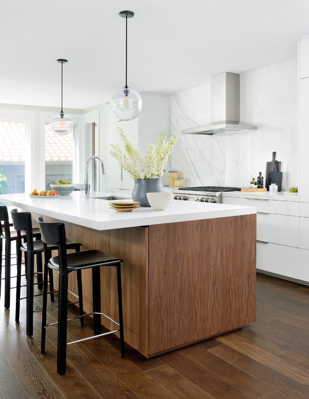
The morning sun washes your kitchen in cool, crisp light, so you rely on matte surfaces and sheer curtains to soften glare. By evening, that same room demands warmth—layer dimmable pendants over the island and hidden LED tape under the cabinets to mimic the sun’s gentle fade. For a living room, place a floor lamp with a fabric shade near your reading chair; during daylight it blends into the brightness, but at night it casts a golden pool. Use mirrors strategically to bounce whatever light exists, and choose bulbs with a warm-to-neutral tunable range. *Q: What is the simplest trick?* A: Install every light on a separate dimmer switch—then you can shift from crisp daytime clarity to intimate dusk drama without changing fixtures.
Layering Ambient, Task, and Accent Lights for Each Zone
Effective zone lighting relies on a deliberate hierarchy rather than uniform brightness. Start with ambient light—soft, diffused ceiling fixtures or wall washes—to establish a comfortable baseline luminance that prevents harsh shadows. Next, introduce task lights like adjustable floor lamps beside reading chairs or under-cabinet strips over counters, aimed precisely at activity areas to reduce eye strain. Finally, layer accent fixtures—narrow-beam spotlights or wall sconces—to sculpt visual interest, drawing attention to artwork or architectural texture without overwhelming the space. This sequential layering of ambient, task, and accent lights allows each zone to shift smoothly from daytime function to evening intimacy, using dimmers to rebalance the ratios as natural light fades.
Choosing Bulb Temperatures and Fixture Heights Correctly
Choosing bulb temperatures and fixture heights correctly starts with understanding Kelvin ratings. Warmer temperatures (2700K–3000K) flatter skin and wood tones, making them ideal for living areas at night, while cooler daylight (4000K–5000K) suits task zones during the day. For fixture heights, hang pendants 30–36 inches above a dining table to avoid glare, but raise them to 72 inches in circulation paths. Adjust downlights to angle toward walls, not seating, to reduce harsh shadows. A common rule: dimmable drivers let you shift warmth without changing bulbs.
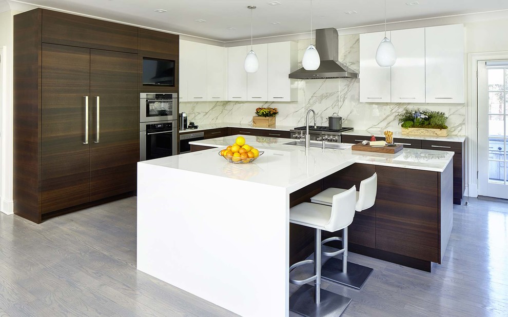
Correct bulb temperature and fixture height selection prevents eye strain and uneven pools of light. Test both before final installation—use a temporary cord and ladder.
What is the best height for a bathroom vanity fixture? Mount the bar at 75–80 inches from the floor, placing the bulb center at eye level (around 66 inches) to minimize facial shadows. Pair with 3000K bulbs for a natural, flattering glow.
What Mistakes Do People Usually Make When Styling a Space?

The most common mistake is pushing every piece of furniture against the wall, which deadens the room’s flow and creates a cavernous, impersonal void. Equally damaging is clinging to a single era or matching set, stripping away the layered, collected feel that defines a polished space. People also ignore scale—a sofa too large or a rug too small throws off the entire visual balance. Lighting is chronically neglected, with overheads left as the only source, flattening shadows and warmth. Another frequent error is decorating with randomness, hanging art too high or placing accents without a focal point. Above all, filling every corner leaves no room for the eye to rest. Quick answer: The biggest error? Buying a rug that’s too small for the seating area—it shrinks the whole room. Edit ruthlessly: remove clutter, anchor your layout, and let negative space breathe.

Ignoring Negative Space and Over-Filling Corners
A frequent misstep in styling is ignoring negative space, which directly leads to the visual clutter of over-filling corners. When every junction of wall and floor is crammed with a plant, chair, or decorative ladder, the eye loses its resting point. This saturation disrupts the room’s natural flow, making it feel smaller and chaotic. The logical consequence is that each object, however beautiful, competes for attention and diminishes the impact of your focal pieces. Instead, allow some corners to remain purposefully bare, creating a deliberate pause that gives the architecture room to breathe. This strategic emptiness, or intentional breathing room in corners, enhances perceived depth and makes the items you do display appear more curated and significant.
Hanging Art and Mirrors at the Wrong Height—and How to Fix It
Hanging art and mirrors at the wrong height is a classic styling error, typically placing them too high and visually disconnecting them from the furniture below. The standard rule is to position the center of the piece at eye level, roughly 57–60 inches from the floor. When a mirror hangs over a console or sofa, leave 4–6 inches of space between the frame and the furniture top. For grouped pieces, treat the entire arrangement as one unit—measure its combined height, then hang the center at eye level. To correct a misplaced item, adjust the anchor point before re-nailing. First, remove the existing hanger, patch the hole, and mark the new placement with painter’s tape at the corrected height. Then, measure twice from the floor to ensure consistency across walls. Finally, use a laser level for precision, especially with mirrors reflecting other elements. If the art is above a tall piece, align the bottom third of the frame with the furniture’s top edge.